CLIQUE LAB
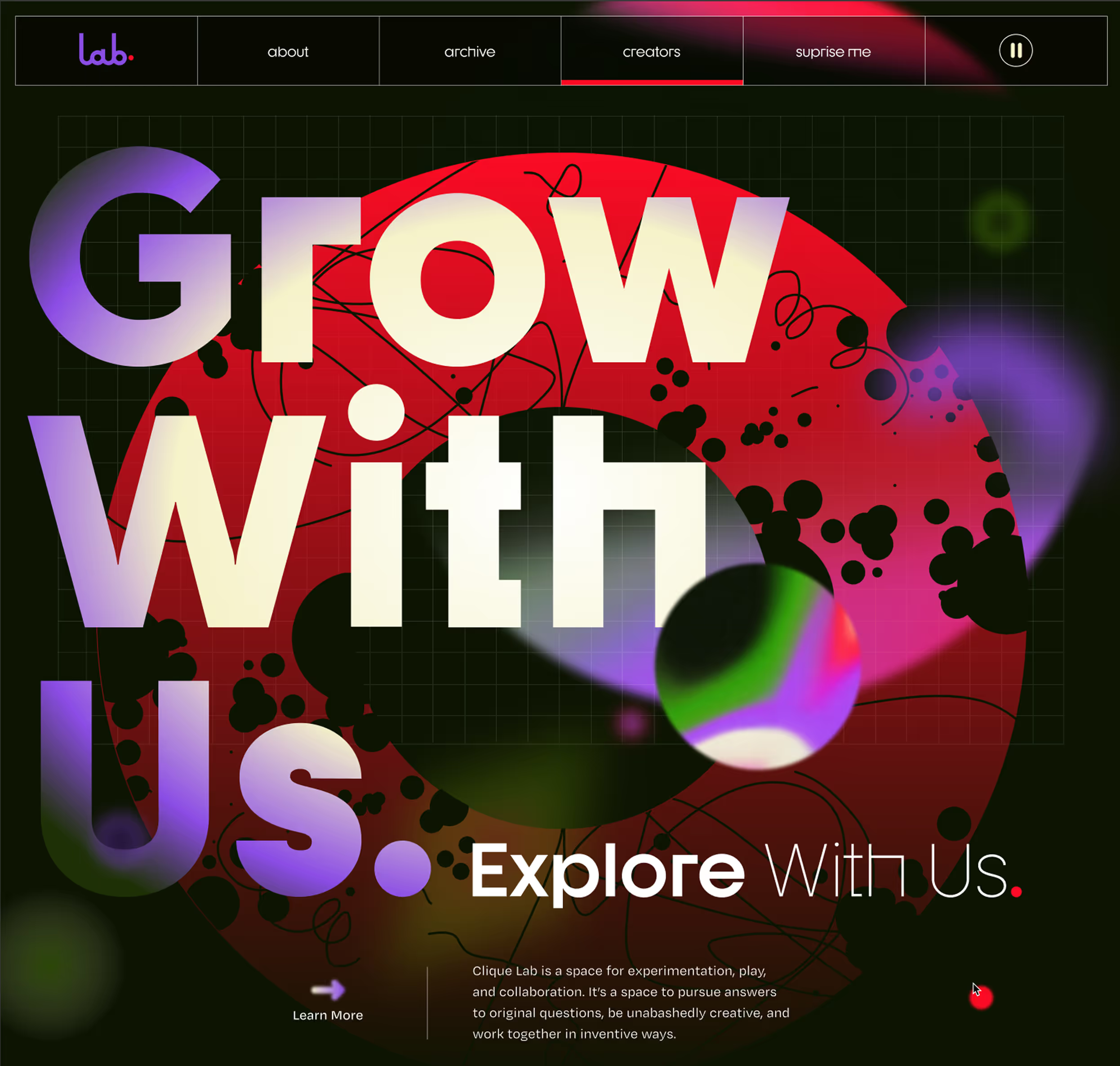
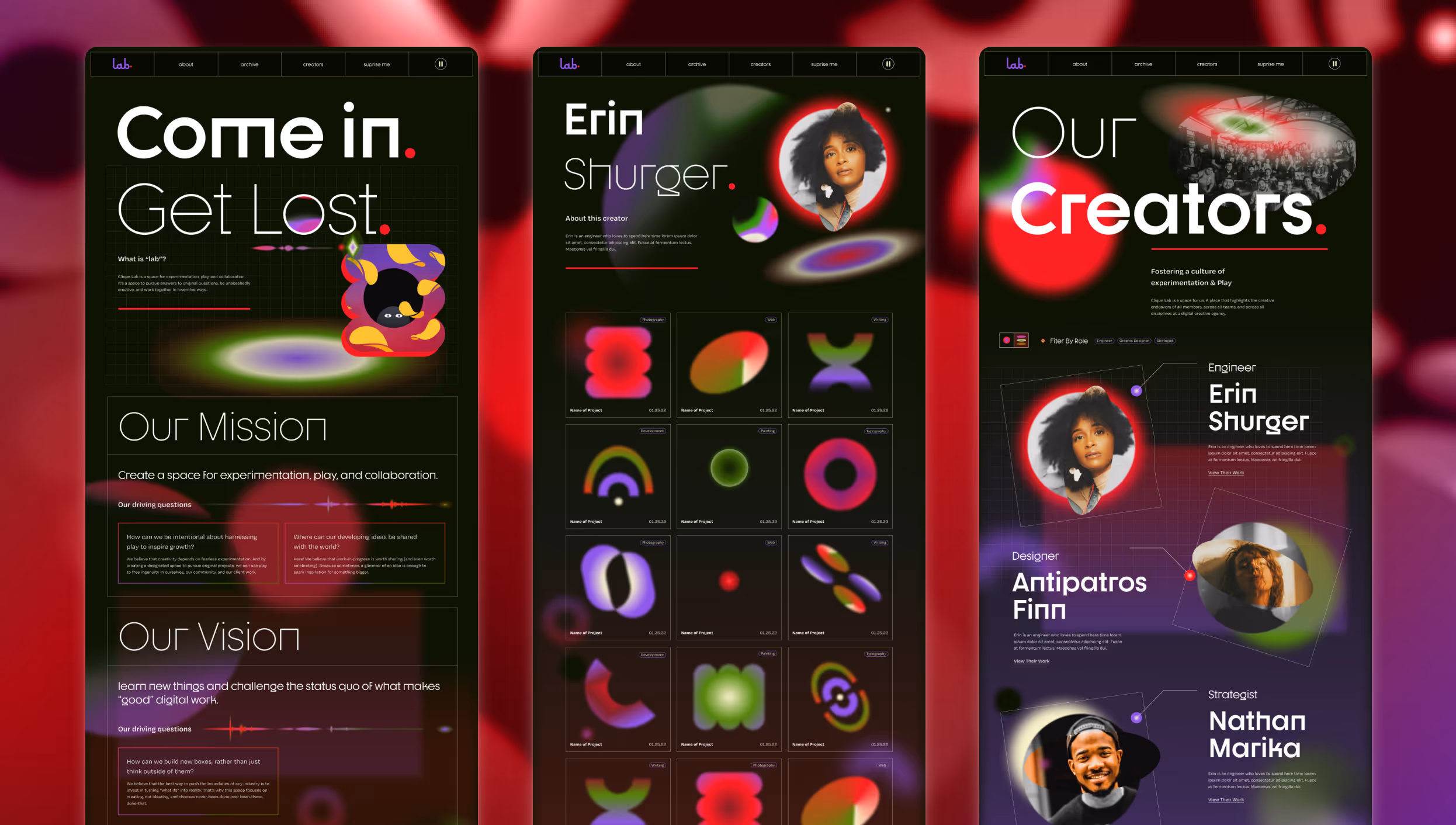
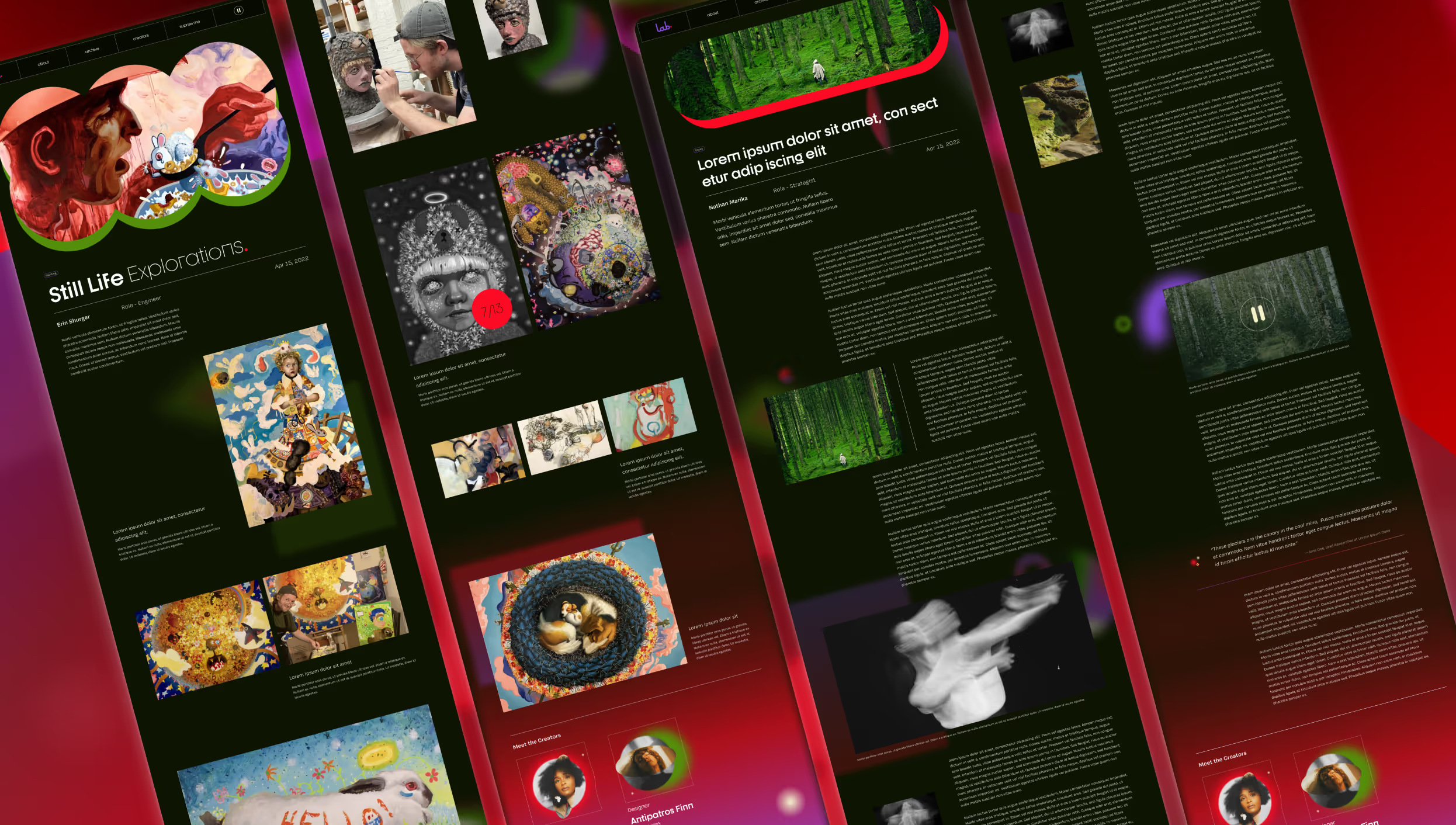
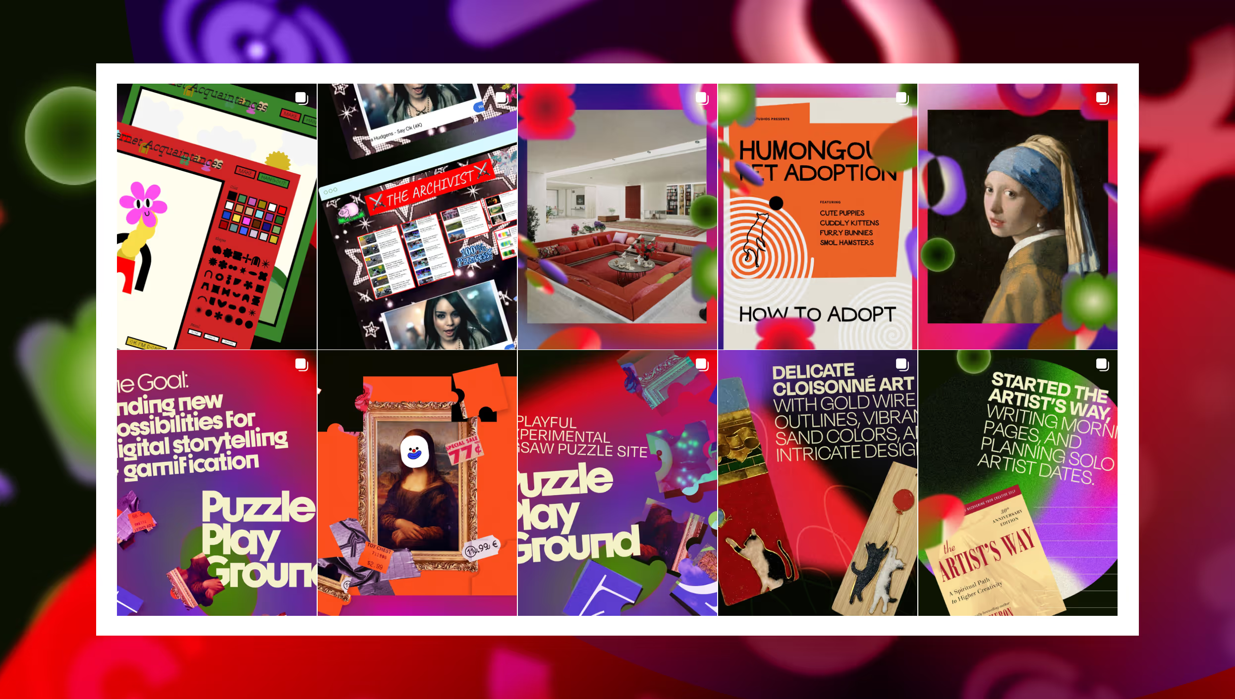
At Clique we often had team and cross-team learning sessions and goals aimed at improving our craft and building on our three core values: build something, be a student and a teacher, and make somebody's job easier. Over the years this led to a lot of experiments, resources, and valuable insights but no real place to store or share them. This is where Lab was dreamed up. Lab was developed based on the idea that creativity depends on fearless experimentation. By creating a designated space to pursue original projects, we can use play to free ingenuity in ourselves, our community, and our client work.
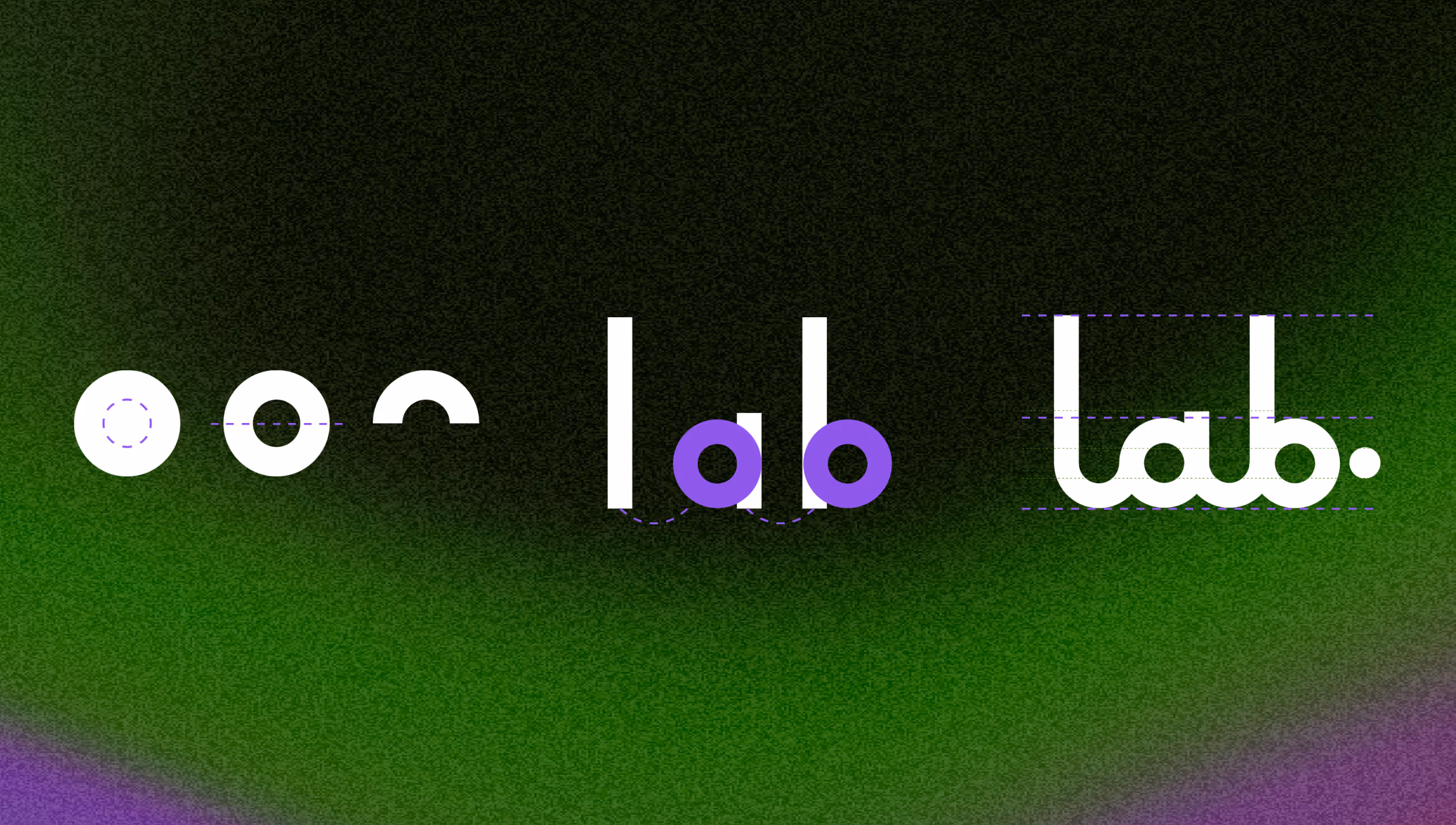
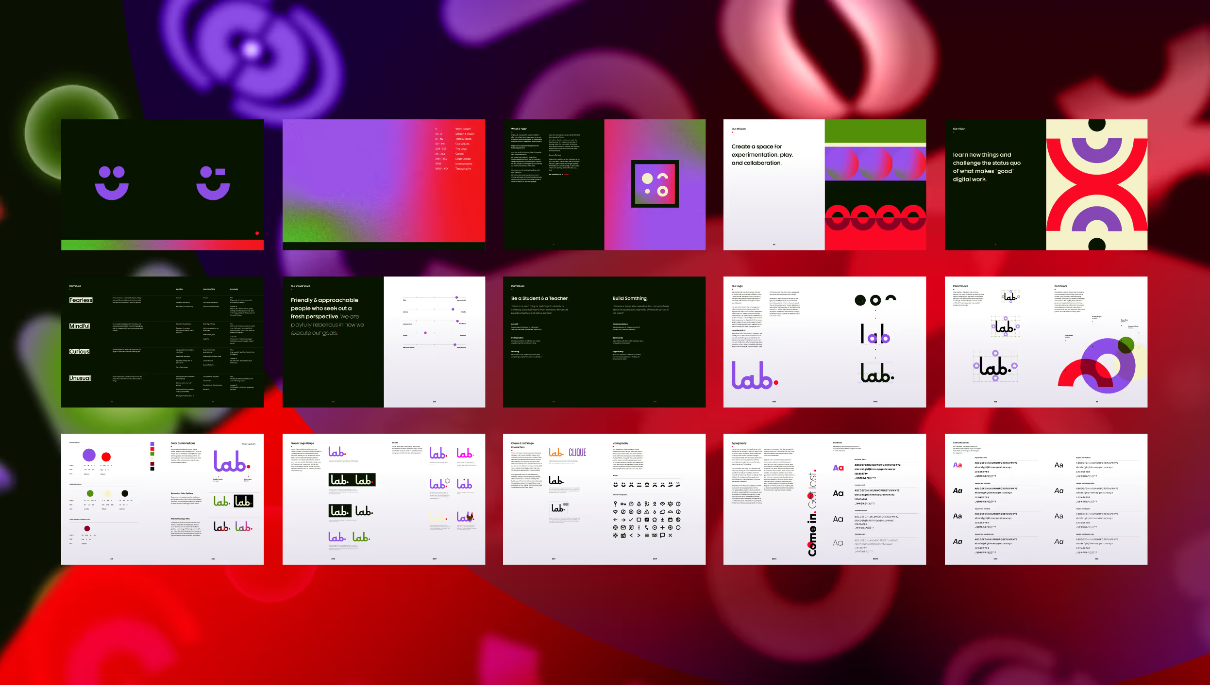
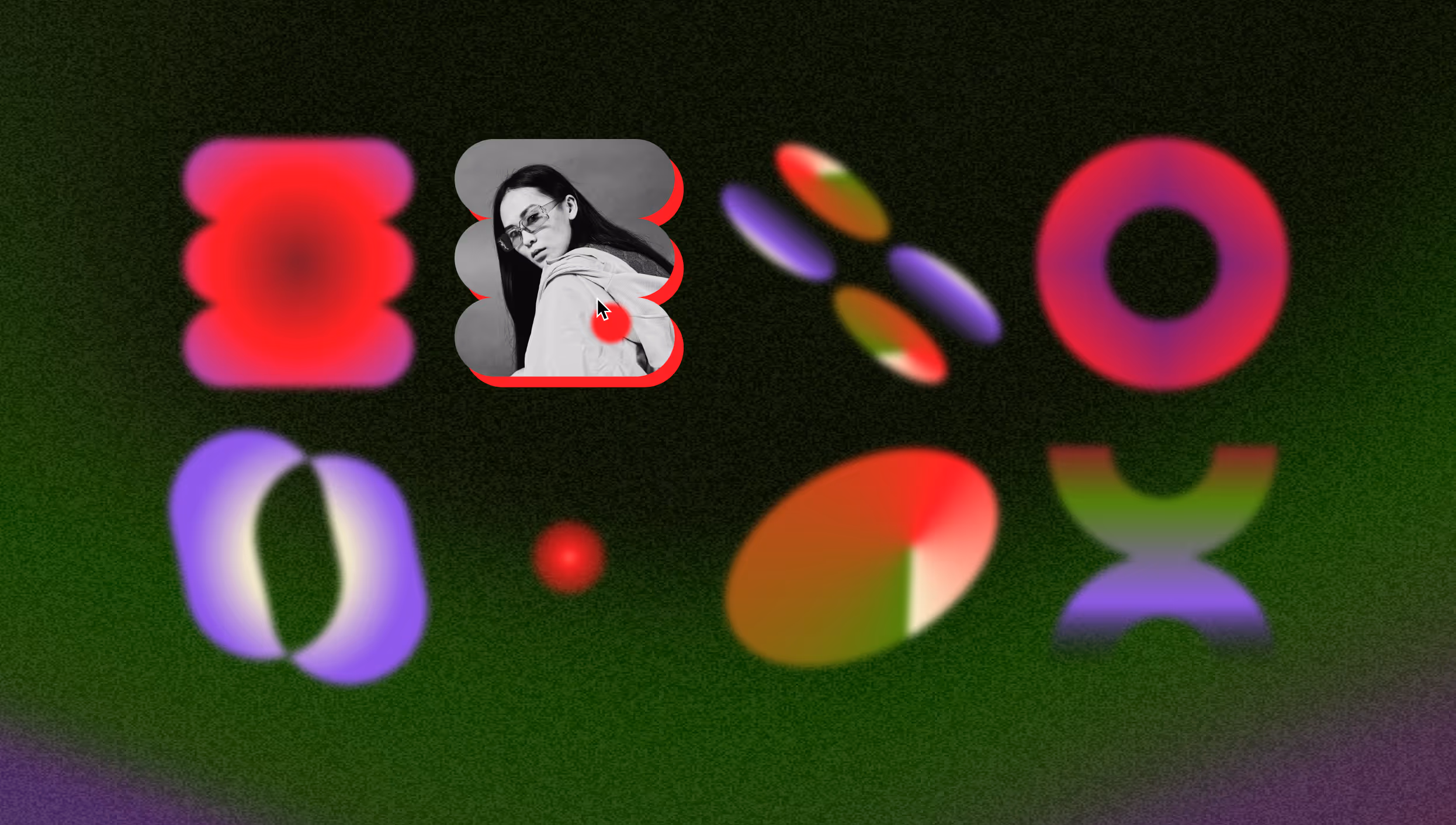
Before we could realize this we needed to determine how Lab would fit in Clique's larger visual voice and ensure it was easy to update and scale. I collaborated with our strategy team to develop our mission and brand identity. Focusing on experimenting, we landed on the name Lab and I developed a logo type and brand guide aligning it with Clique's "old but new" direction. The logo has a 70s vintage feel whose fluidity mimics lab equipment and test tubes, with minimal sleekness that adapts across Lab's myriad visual styles.
I then designed a website that could house our musings, accommodate various media types, and be easy to update across teams. I worked with our development team to create a unique homepage while the rest was built in Webflow, allowing team members flexibility in updating and scaling their work. The result is a living, breathing site that all members contribute to, tracking our learnings and highlighting the team's skills for future clients.

.gif)
Additional work samples available upon request.

